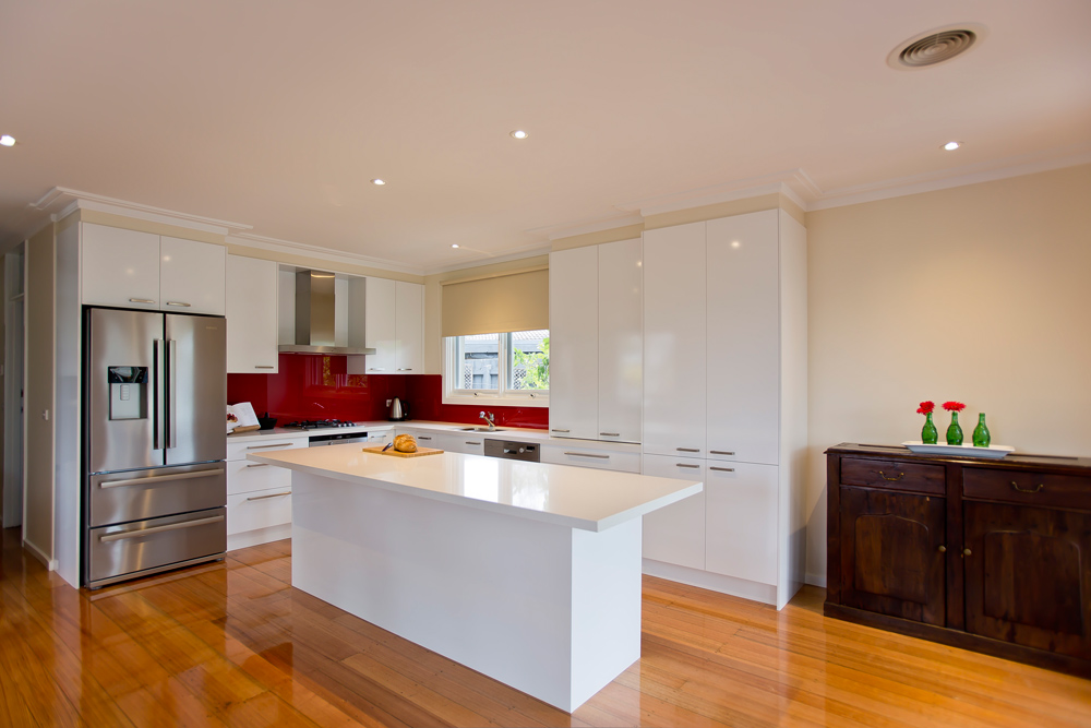
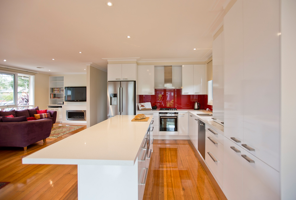
This late 20th century home was fairly modern with timber floors and a truss roof but the old kitchen just had to go so the owners approached Kitchen Update with a view to creating a larger, more user-friendly kitchen/dining/family and TV room. This would serve the double purpose of incorporating the rarely-used formal dining room and allow the opportunity to create a larger kitchen with a more practical layout.
In addition, the client requested a gas fire be incorporated into the design.
 This was a big job that required walls to be removed, or partially removed, to create the large, open plan space required by the owners. Upon demolition, issues were discovered with old plumbing work so it was essential to re-strengthen the roof truss to ensure the integrity of the new space.
 Once this was complete, the wall between the formal dining room and the casual family meals area was removed and the wall between the formal dining room and the hallway was partially removed. This opened up a large open space with views and created a flow-through to the new kitchen, dining and living spaces.
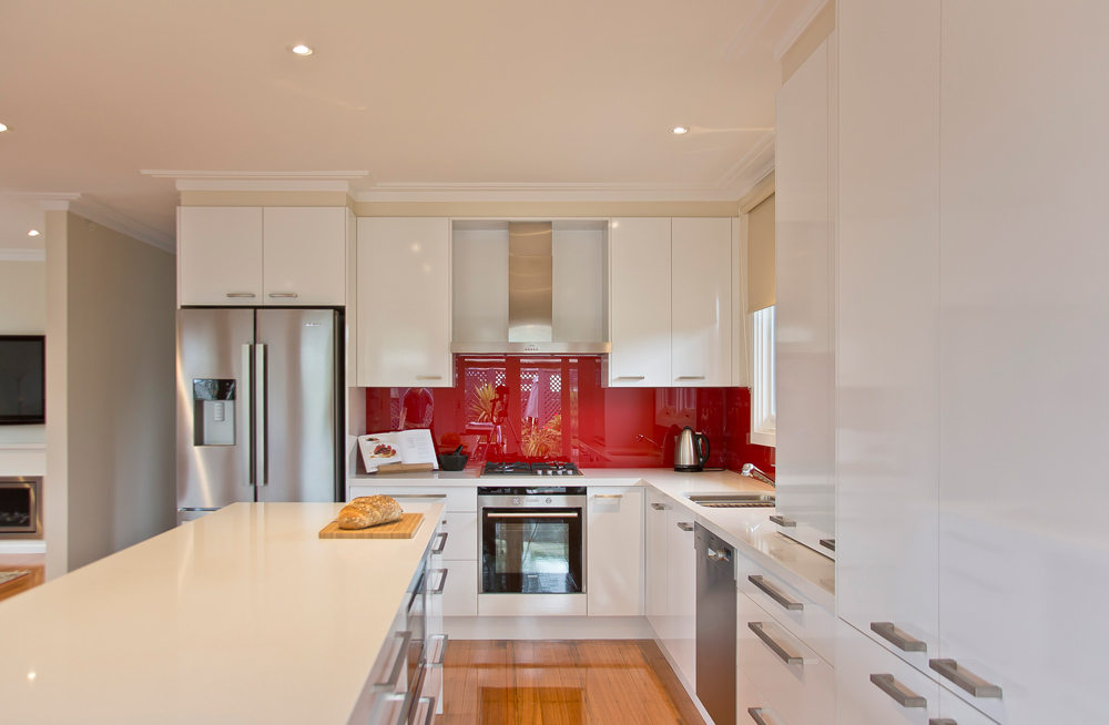
 In designing the kitchen careful consideration was given to the client’s desire to be able to see the television from the kitchen. An overhang at one end of the island bench with a view through to the television was created with enough depth to allow the client to comfortably sit during food preparation and watch TV. The contemporary design of the kitchen features a large island bench with overhang on two sides with much sought after flow through to the newly created living zone and casual meals area.
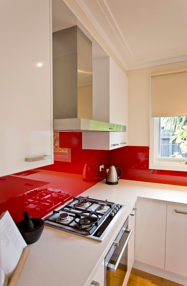
A small appliance centre is conveniently located behind bi-fold doors and within close proximity to the preparation area. All cabinetry featured is easy clean Laminex ‘Polar White Silk’, as are the ‘Ocean Foam’ CaesarStone countertops. The red glass splashback was chosen because, again, it is easy to clean and the colour toned with the client’s jewel-coloured furnishings.


I love everything about this simple kitchen: Only hope ours which is being done now will look as good: we have same type of floor and are going for white on white with handles on lower cupboards too. But why did you choose a red glass splashback? They seem more dated these days. Was it because of the need to match decor in adjacent room/s.
Good Morning Bronte, With apologies in the delay in responding to your kind words. Hope the kitchen renovation turns out well and is really enjoyable to work in.
The choice of the Dulux “Red Box” splash back was our clients choice, she really loves that shade of red and it also sits well in the colour scheme of other area’s we renovated as she has a lot of original aboriginal art work she collected over twenty five years living and working in the Northern Territory. Hope this answers your queries. Regards Allan